Strategic typography has the power to build a brand, draw the eye of the consumer, and inspire brand awareness. Just like your logo and colour scheme, your typography needs to be kept uniform across all your marketing and communication channels to establish a cohesive, easily recognisable brand.
Much like your logo, your chosen typography should represent your brand personality and encourage your target market to engage with your content. Great examples of strategic typeface can be found on the covers of some of the world’s most celebrated books.
Let’s take a look at some of the most inspired book typefaces that tantalise and draw the eye, and get the audience reading!
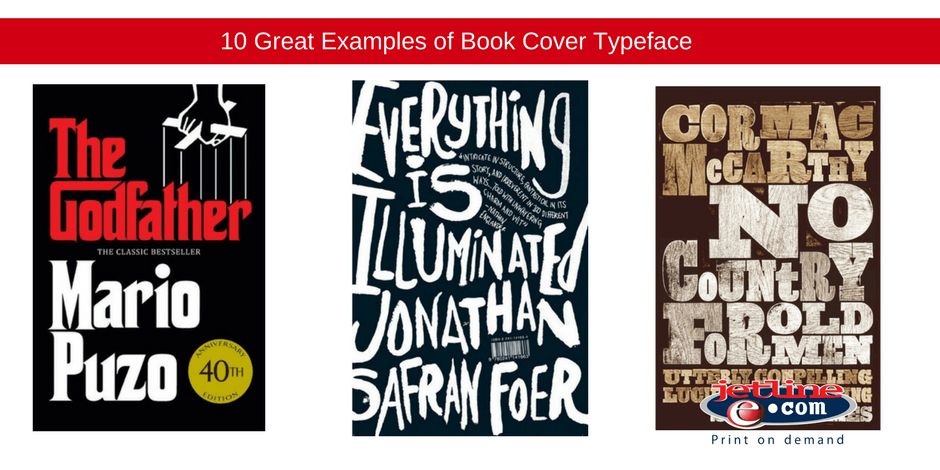
The Godfather – Mario Puzo

The Godfather is a brand in and of itself, from the original book cover (1969) to the film poser and merchandise. We immediately recognise the typography and associate it with The Godfather canon.
So where did this iconic design come from? S Neil Fujita, an American graphic designer created this gothic, heavy and bold typeface encapsulates all that the book represents – family, power and fear.
No Country for Old Men – Cormac McCarthy

Cormac McCarthy trusts his book covers with designer David Pearson. Pearson used an old style slab serif typeface in this design, which imitated the look of raw letterpress printing. Just as the book speaks of a rustic generation, so too does the typography presented to the viewer.
Everything is Illuminated – Jonathon Safron Foer

Gray318, as he is known worldwide, is one of the most applauded print designers and book designers out there. Real name, John Gray, he created designs for AM Holmes, Zadie Smith, and Joe Dunthorne.
For this design, Gray created an energetic, fluid, and active hand drawn font. The premise of the novel is just as active as the design, as it jumps between two stories seamlessly, constantly engaging the mind of the reader, taking them on an energetic journey.
Snuff – Chuck Palahniuk

Palahniuk is a brand himself, famous for writing Fight Club, Palahniuk places great emphasis on his book art and typography. He understands the value of design, and turned to well-known designer Rodrigo Corral, to create the cover for Snuff.
A provocative story, the dark and alluring design is a perfect visual representation of what lies between the pages.
The Spy who Loved Me – Ian Fleming

In 2008, in honour of Ian Fleming’s birthday, Penguin commissioned famed designer, Michael Gillette, to create fourteen new covers for the Bond series of books. Each of the book covers is different, however, the retro-style remains, and on all books the title is painted suggestively across the curves of the bond girls.
A sexy story? Yes. A sexy font? Of course!
The way through Doors – Jesse Ball

Designed by arguably the two most talented cover creators, Helen Yentus and Jason Booher, the acclaimed novel’s cover makes use of illusion in its design. It uses slab serif typeface and creates the illusion of layered paper, creating clean lines and evoking a clinical feel.
This perfectly reflects the story of a hospital patient struggling to remember details of her car accident.
For the Union Dead – Robert Lowell

Berthold Wolpe, the art director of Faber, and designer of the iconic Albertus typeface, designed a few covers for Robert Lowell. Ever the innovator, Wolpe created this design in response to the typically illustrated covers of the era.
This is why innovation is vital to marketing – see what your competitors are doing – and do something different! No one likes a boring, template-like print, you need to keep it unique to your story, and your brand.
The Casual Vacancy – JK Rowling

This is Rowling’s first book since her iconic Harry Potter series, and she had to present it to the world with a bang. It was also vital for the author to separate this book from the famous Potter franchise, and create something unique. Potter fans were shocked at the release of the book, as it featured hand lettering by design Josh Holland – nothing in-line with her usual fantasy covers and fonts.
Famous designer John Gray said it best when discussing the controversy around the books design, “As a designer I’m left non-plussed and envious, and as a reader I’m left intrigued. That means another copy sold, so, job well done!”
Jetline: Printing Company South Africa
As a professional printing and graphic design company, Jetline understands and appreciates the importance of all elements of book printing, from typeface and design, to paper stock and binding.
For all your book printing needs, contact the Jetline professionals today!

