What does it take to design an imaginative and successful poster print? Let’s take a look at some great examples of creative poster design, from horror films to western inspired imagery, these are truly printspiring!
Ant Man

Marvel films are renowned for their character based movie posters. But this Ant Man poster deviates monumentally from the Marvel norm. The movie poster definitely got fans buzzing. It’s smart, witty design makes the viewer pay attention and embrace the silliness and tongue in cheek concept of the “Ant Man” super hero.
Quirky, imaginative and eye-catching, a poster that definitely makes you look.
The Revenant

This attention-grabbing poster was designed by one of the greats, Neil Kellerhouse.
Kellerhouse is the designer behind some of the greatest posters of this generation, including The Girl with the Dragon Tattoo and Gone Girl.
All of his designs combine a sense of drama, and visual simplicity. This image is not the usual Hollywood blockbuster promotional tool, rather it appeals to audience curiosity. The film stars Leonardo DiCaprio and Tom Hardy, two of the biggest Hollywood draw cards in film at the moment. They are not present on the poster at all. Instead, we are hit with a foreboding image that makes us want to know more.
It Follows

An ultra-paranoid tone combined with the horror aesthetic of the 80s, the film poster for “It Follows” is particularly powerful – showcasing the cinematography and style of the film effortlessly.
The print was designed by Akiko Stehrenberger, who was clearly inspired in its creation. What makes this poster so refreshing is its deviation from modern day horror posters that try to be as ominous and dark as possible. This posters aesthetic is anything but dreary and takes us back to vintage horror/thriller posters reminiscent of The Thing and North by Northwest. With this in mind, we all know that something different is something that will pique the consumers interest immediately.
Macbeth

In stark contrast to The Revenant, Macbeth features the faces of the film’s stars. This poster is impressive as it combines all elements of the typical film poster: portraits, large sans serif script and images of the stars of the film. However the poster manages to stand out because of the designs use of negative and positive space. This creates a visual that instantly draws the eye.
Beautifully understated…
Sicario

Design House LA brought us one of the most eye-catching film posters of the 21st century. The film actually had a variety of posters, all created by LA, and this image was not the most used but it is the most aesthetically rewarding.
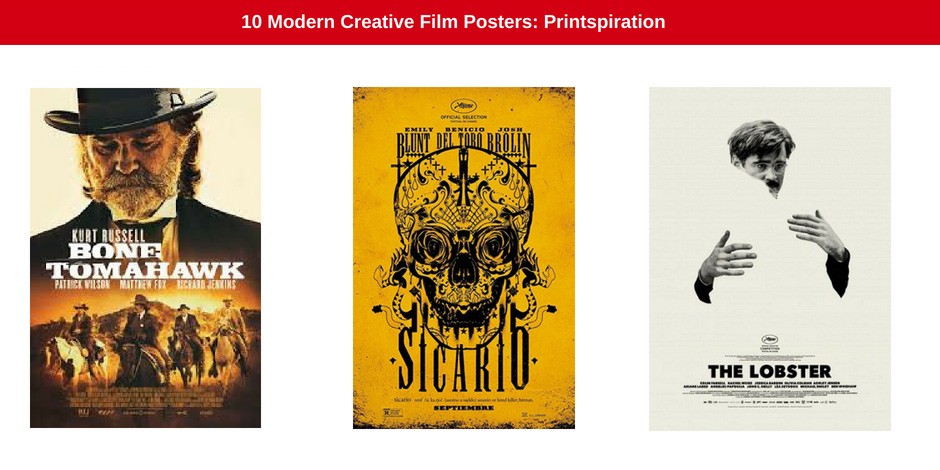
With a dirty gold background, tattoo-like skull made up of roses, spider-webs, snakes and thorns, is without a doubt the most striking of all the films posters. It’s a busy design, but so intricate that it draws the eye instead of forcing the viewer to avert their gaze. Every time you look at the poster you see something new – pure print art.
Bone Tamahawk

This poster takes us back to the vintage western films of yesteryear. When it comes to graphic design in general, we have seen a massive shift toward vintage, retro styles and the film industry is no different. This is a cool, modern take on a tried and tested design and gives the viewer a taste of the films genre immediately. It is designed to get any Western aficionado excited.
As they say, give the target market what they want and love when it comes to your marketing!
Louder than Bombs

As opposed to the film’s title, this Joachim Trier film was quite muted in its reception at Cannes Film Festival. The problem was in the poster design – the design was so good that it set expectations high. The imagery showed up everywhere and people were excited to see the story line behind the print.
So why was this poster design so successful? It went against trend.
Most graphic designs as of late incorporate illustrations and take a more pictorial route. This particular design embraced the simple photographic treatment. The minimalist photograph spoke volumes, providing a sense of modernism.
Faults

As opposed to Louder than Bombs use of simplified photography, Faults created a shredder photograph poster.
Immediately we get a sense of the characters, their twisted minds and disordered thinking. The image is the perfect visual representation of the story line. An unsettling and imaginative design, the poster, much like the film, did not disappoint critics.
Queen of Earth

This is what happens when an artist and a filmmaker constantly collaborate. Alex Ross Perry and painter Anna Bak-Kvapil have created magnificent imagery together. Her artwork has taken centre stage in this poster – a single illustration of actress Elisabeth Moss with a messy mascara stained face, windswept hair and a triple header.
Much like Faults, the striking imagery speaks of sanity and the breakability of sanity at the same time. This is a lesson for all marketers and designers – the visuals used in any branded materials, from brochures to billboards, should automatically tell the viewer what the brand is about. A running theme in all of the posters on this list.
The Lobster

Once again we see the magnificence of negative space and simplicity. This film was one of the most intricate and arcane films of 2015. Yet it had the most simple poster, a genius move on the designers part. This lo-fi design (popular for business cards and brochures) gives an emotive feel to the design and is visually striking, poetic and absurd all at the same time.
The melancholy-feel perfectly encapsulates the film in the most simple of ways. Beautiful design, creative implementation… pure printspiration.
Poster Design and Poster Printing
The role and aesthetic of the poster is always evolving, meeting the ever changing trends of society. The poster continues to flourish and still plays a major role in advertising, music, marketing and art.
If you are thinking about creating the ultimate poster to promote your business, brand or event, you have come to the right place. Your poster needs to reflect your message, tell your story and catch the eye of your target market. It is important that you work alongside an experienced design and print company to help you put together a poster that gets clients and potential clients talking.
Contact the print, branding and design experts today – the Jetline professionals are here to help!

