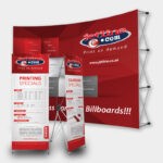
Print advertisements, from billboard prints and brochure prints to magazine adverts are still one of the most powerful weapons in the marketer’s arsenal. In the online age, it is easy to forget the impact artistic and inspired print adverts have on the consumer.
Let’s take a look at 10 powerful print marketing campaigns that got the consumer talking:
Rolling Stone

Rock music meets the art of Photoshop. Developed by Milan based marketing company DLV BBDO, the simple yet powerful image fully embraces the lifestyle that Rolling Stone Magazine represents. To sum up the image: music gives the Rolling Stone audience life. The dark, grotty image and the signature-like font is strategic, fully embracing “rock ‘n roll” style.
The entire design faultlessly represents the aesthetic of the rock ethos. Every element of this print advertisement has been thought through and executed to perfection. The perfect example of when graphic design, strategic branding and print come together powerfully.
Whiskas

This campaign shows a domesticated cat in a different environment – the wild. The Whiskas campaign by Abbott Mead Vickers BBDO, features this cat in a variety of scenarios in the African wild. The campaign is entitled, “Big Cat, Small Cat.”
The advert highlights the innate instinct of a cat, and embraces the Whiskas slogan perfectly. The slogan being: “Feeding your cats instincts.”
Duracell

This print advert was developed by Singapore based agency, Grey.
And this advert is definitely unexpected, especially coming from an established brand like Duracell. We are used to the fluffy, relatable Duracell bunny and this ad is far from cutesy – quite the opposite.
Think about the tagline and take a look at the doll standing by the door, peering in on her owner… “Some Toys Never Die.”
Terrifying, yet genius.
Opel

A while back Oprah launched a campaign to educate the public about the dangers of texting and driving. This is still a massive societal issue, causing thousands of accidents on the road.
Opel tackled this issue smartly through this advert by Gitam BBDO. This simple design draws the eye to the text box immediately and the viewer reads the copy easily. So, have you got the message now?
Powers Whiskey

Powers Whiskey is the second largest whiskey brand in Ireland. This campaign was put together by the combined power of photographer Andy Glass and production studio Taylor James.
This collaboration resulted in a series of stunning print adverts embracing earthy tones and honey notes. The team used landscape photography within the liquid of the whiskey, creating a photo realistic look for the billboard print campaign.
Pure class.
B&B Hotels

This clever advertisement from creatively renowned German agency Publicis, can be considered a work of art in the advertising sector.
Bead and Breakfast adverts are usually run of the mill, and incredibly dull. This campaign places an unexpected twist on the usually austere business, giving the viewers a visual feast!
Bosch

How cool is this design? The effect of the wood is simple enough so as not to overwhelm the viewer. The tag line of the campaign is “Unexpectedly Powerful,” and is showcased through the drill that appears to have actually spiraled the wood itself.
The creative team behind this Bosch campaign went all out with this cool, thought provoking, yet simple design.
Schusev State Museum of Architecture

One of Russia’s most famous buildings is the Schusev State Museum of Architecture. With the tagline, “Discover the full story,” Saatchi & Saatchi developed a magical print campaign for the museum. This illustration depicting St Basil’s Church in Moscow perfectly embraces the imagination and innate creativity that goes into designing such epic buildings.
Not only does it catch the eye, it captures the imagination.
Utopolis Group of Cinemas

This is just hilarious. Yes, it may not be artistic and beautiful – but it grabs your attention! Duval Guillaume, a Belgian advertising agency, added a quirky twist to the brand through this strategic imagery. This image depicts the famous and highly romanticized “King of the World” scene from the cinematic blockbuster Titanic.
The image shows us that life does not live up to our film expectations exactly. So basically, reality sucks and this is why it is important we let ourselves get lost and escape into the world of cinema from time to time.
Times India

The tagline of Times India is, The Identity of young Chennal. So much can be done with a tagline like this. Just ask yourself, what IS identity and what does it actually mean? Times India perfectly encapsulated Identity and Print in a single and simple image: a fingerprint made up of print magazines. Nuff said.
Jetline: Professional Printing Company South Africa
The role and aesthetic of print marketing is always evolving, meeting the every changing trends of society. These marketing materials continue to flourish and still play a major role in advertising, from billboard prints to brochures and business cards – print marketing thrives. If you are thinking about creating the ultimate print campaign to promote your business, brand or event, you have come to the right place.
Your print marketing material needs to reflect your message, tell your story and catch the eye of your target market. It is important that you work alongside an experienced design and print company to help you put together a print campaign that gets clients and potential clients talking.
Contact the print, branding and design experts today the Jetline professionals are here to help!

