Print design is a niche specialty, especially for graphic designers in the digital age. If you are a novice designer looking to better your print design skills, take a look at these 10 top tips to better print design.
The Bleed Area

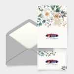
The bleed area is a term that describes a document which has elements or images that touch the edge of a page. When a print design has a bleed area, it means that the document must be printed on a bigger sheet of paper and then trimmed down.
For example: If you are working on a brochure that has images that reach the side of the pages, you need to supply your printing company with a document that is a bit larger than the final document will be. This is to ensure that the printer does not cut-off the images.
The standard size for the bleed area is 3mm but may vary.
The Overprint Option
Are you limited by budget and only able to use 2 Pantone colours in your design? This isn’t an issue! This allows you the opportunity to get creative. And what graphic designer doesn’t like a creative challenge?

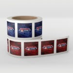
With overprint options, you are able to gain more depth with limited colour. Take a look below and see how overlapping of colours can make a design that much more eye-catching.
You can even make this work with photographs using only 2 colours. Experiment by using Monotone or Duotone options in this regard.
Think Outside the Lines
Never underestimate the power of the human mind. Our minds can fill in gaps and view the bigger picture. Making creative use of your paper can be great when executed professionally.

Always remember that your print design does not have to end at the edge of your print. There is always room for creativity.
Don’t be Held Back by Paper Size
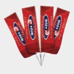
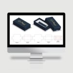
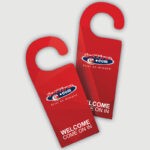
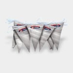
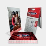
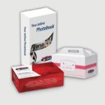
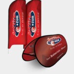
Never feel limited by paper size, you don’t have to stick to a standard A4 flyer. Get creative! Go for rounded edges, or create an accordion/ pop up print design! Your options are endless thanks to advanced die-cut print technology.


Speak to your printing company and learn more about the options that are available to you.
Readability
Are you working on a text rich print design such as a brochure or booklet? In print design, you need to spend a lot of time concentrating on the text. As they say, content is king. Typography is a vital part of your design process.

Aim for ‘eye-catching’ but always remember that readability takes precedence.
Typography and your Design
If your typography is bad, your entire design is bad. Your chosen font sets the tone for your entire design. A font gives voice to your design. Don’t just pick the first one you like, think about the audience and the voice you want to communicate to them.

Discover which fonts mix and which don’t. Consider your header font and how it works with the font used in the body of your content. As mentioned previously, readability should be your priority when it comes to font selection. This is rule number one!
Content: Less is More
If you feel like your design is cluttered with text, it probably is. Take a look at what is necessary, ensure the message is reflected, and that the Call to Action is visible and easily interpreted.

At the end of the day, when it comes to design, less is more. You don’t want to overwhelm your audience. If you do, they aren’t going to read your content or digest your message.
Always Keep to the Grid
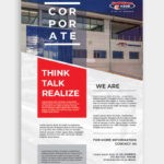
When it comes to good print design, always work with grids. Make use of composition guidelines and proportional relations to form the foundation of your print design idea.

There are many grid options to choose from, from the standard 3 column grid as seen above to 2 column overlaps. Play around with your design to see what works best for you.
Invert to make an Impact
Want to make a bigger design impact? Why not invert? White on black, or any dark colour for that matter, will make your design stand out.

It is important to note that you need to be careful with smaller type sizes when going for the invert design, IE: 8pt/ lower. Inverting these designs may be a problem as ink flows around a bit once your design has been printed. This is knows as trapping. Of course, it all depends on your chosen paper and print speed.
In this regard, chat to your printing company before assuming you can’t invert your smaller designs. Technology has advanced and professional printing companies will have a solution in this regard.
High Quality Photographic Content

Always request high quality photographs. A great image can take your design to the next level of excellence. A pixelated, low res photograph will immediately ruin your design. A poor image makes for an unprofessional design which makes for an unsuccessful print campaign. Always demand high quality photographic content!
Jetline: Professional Print Design and Printing Company South Africa
At Jetline we understand and appreciate the importance of print marketing materials. We have put together print options to suit all budgets. Our team work with you to ensure the ultimate end result.
Contact our experts today for more information on all your printing requirements.

