Launching a new business and beginning the branding process? Or looking to re-design your current logo?
Don’t know where to start? Logo design can be overwhelming, but it doesn’t need to be.
Why not begin by deciding on what type of logo style you want for your business? Sometimes the best way to take on any massive task is to get back to basics.
Breaking it down to the basics, logo design can be split into 5 styles: Lettermarks, Wordmarks, Brandmarks, Combination Marks, and Emblems.
Obviously, not every logo fits perfectly into one of these 5 categories. This is just a way to get your creative juices flowing and help you find some branding inspiration.
Lettermark
The Lettermark logo, also referred to as a monogram logo design, is made up of the initials of a business, instead of its full name. Some well-known brands that make use of the Lettermark logo include: Home Box Office (HBO), Cable News Network (CNN), and Aeronautics and Space Administration (NASA).

A Lettermark is an excellent choice for a business with a long name, or a name that is difficult to pronounce. When a company name is too long, it is difficult to create a logo using the full text. This is because a lot of text will be obscured when shrunk down to fit mobile devices, tablets, and business cards.
When designing a Lettermark logo, consider the importance of the font. The design needs to be visually distinctive, making it easier for the brand to be recognisable.
Wordmark
The wordmark logo, also referred to as a logotype, is the simplest of logo designs. This style casts the brands name in text, and text alone. This kind of logo design can be based on signatures, handwriting, custom fonts, or in some cases, existing fonts. Some well-known brands that make use of the Wordmark logo include: Coca-Cola, Mobil, Disney, Google, and Canon.

This kind of simplicity is great for big brands as it portrays a sense of stability, confidence, and history. However, it is also a good choice for start-up businesses too because it contains the company’s full name, which helps to establish the brand.
Brandmark
The brandmark, also referred to as a pictorial mark, is an icon, image, or symbol with no text. Some well-known brands that make use of the brandmark logo include: Nike, WWF, Apple and Target.

Having a brandmark as a logo design is an effective way to create a psychological connection between your brand and your audience. People respond to visuals on a deeper, more instinctive level than they do with text.
If you are a global brand, by using a brandmark as your logo, you will break through any language boundaries. Think about it, the Instagram logo, a simple camera icon, speaks to a worldwide audience. However, if you are a start-up company, it will be difficult to take on a brandmark. Many brands evolved to brandmarks after establishing their name first. If you are looking to re-brand, and already have a dedicated audience, then a brandmark may be just what you need to establish yourself further as a trusted, reliable, brand.
Combination Mark
A combination mark, also referred to as iconic logotype, is a combination of both symbol and wordmark. Some well-known brands that make use of a combination mark include: Adidas, Lacoste, Pizza Hut and McDonald’s.

Combination marks leave room for brand expression, giving you a way to convey a visual representation of your brand as well as your brand name. This kind of design is good for lesser known businesses, as it makes your brand more distinctive and it is less likely to be confused with another brand.
However, this kind of design may be a problem when the logo is reduced in size for various designs. Therefore, the elements should be able to be used separately. The Adidas logo is an excellent example of this.
Emblem
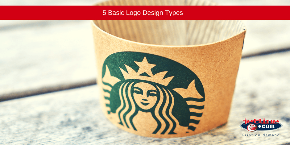
Just like a combination mark, an emblem design is made up of a symbol and text. However, the difference is that the emblem logo design has the text appearing within a symbol. Some well-known brands that make use of an emblem design include: Burger King, Starbucks, and Harley-Davidson.

An emblem design is less flexible than a combination mark. This is because their elements cannot be separated. This kind of design is usually used by organisations such as sports teams, schools, and government institutions. Because this kind of design resembles a seal, or badge, it elicits a feeling of authority. This makes the brand seem trusting, and somewhat powerful, that is why you find it will be used for government agencies and universities frequently.
JETLINE: PROFESSIONAL GRAPHIC DESIGN AND PRINTING COMPANY

Your logo forms the foundation of your brand and brand identity. It is what is seen on all your marketing materials, from your business cards and packaging through to your corporate stationery and social media platforms.
When the consumer views your logo design, they should immediately recognise your business and service/ product offerings.
Designing a logo is not an easy process. It takes strategic thinking, testing, and a professional graphic designer.
Looking to create an effective and eye-catching logo for your company branding? One that will work across all your branding platforms, from print to digital marketing?
Contact our graphic design, print, and branding experts today.
Find your closest Jetline branch here.

