The logo is one of the most essential elements of company branding. It is always a good idea to take a look at some of the worlds top brand logos, and to learn from them.
Here, we take a look at the worlds top brand logos, discuss their success, and what we can learn from them.
McDonald’s: It is OK to evolve your company branding


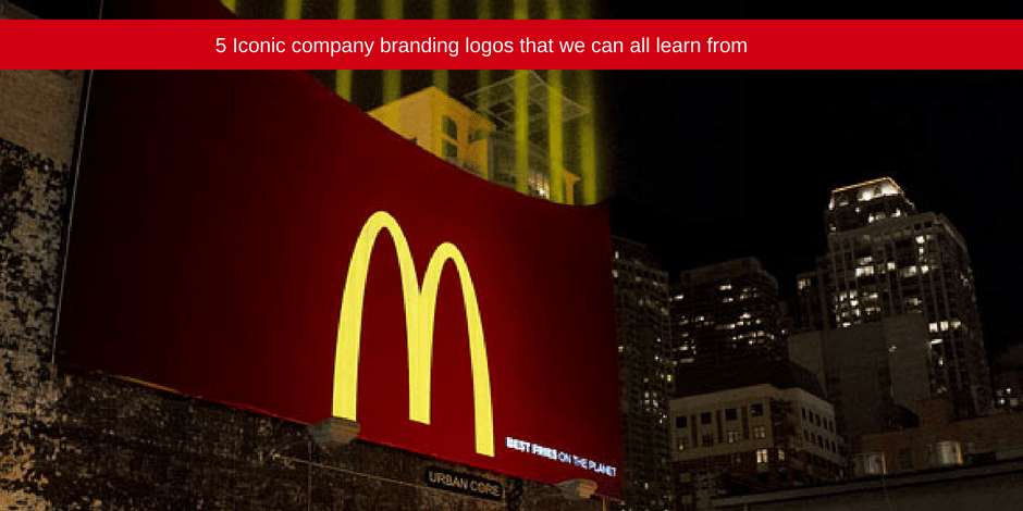
What would a blog about recognisable logos be without the McDonald’s golden arches being mentioned? McDonald’s opened its doors in 1940 and was known as “McDonald’s Famous Barbecue.” Today, it is the biggest fast food chain in the world!
The first iteration of the now famous “M” logo only appeared in 1961.The brand has evolved over time and has had many updates and variations. These updates have included: new slogans, added shadows to the design, and most notably the removal if the chains name that at a time was always present below the arches in all company branding and marketing materials.
The brand teaches us that it is ok to evolve with times. The brand itself even changed its voice in the wake of rising childhood obesity. It switched its core marketing focus from Happy Meals, and the antics of Ronald McDonald, to eco-conscious.
The golden arches remain to this day, but the primary red colour has been switched to a deep green in many European countries – to enhance its eco-conscious agenda.
Coca-Cola: The importance of brand heritage

The Coca-Cola formula was perfected by Dr John S Pemberton in the 1880s. However, book-keeper Frank M Robinson is responsible for the brands look and feel. He came up with the name and created the brands famous cursive script. This design has defined the Coca-Cola’s company branding for over a century.
Robinson chose to go with a Spencerian script for the brand, which was fashionable in the late 19th Century. However, while other brands dropped their handwritten typography, Coca-Cola stuck with its original cursive design.
Of course, there have been subtle changes and refinements, but the branding has stayed true to its heritage, and its cursive script has helped define the world-famous soft drink.
What we can learn from this is that sometimes brand heritage is brand collateral and far too important and recognisable to lose.
Nike: Keep it Simple, Stupid

Another icon of branding, Nike has one the worlds simplest logos. And this simplicity is part of the brands appeal. The creator of the Nike swoosh is Carolyn Davidson. She was just a student when she designed the swoosh and was paid a mere $35 for it!
The thought process that went into the design is impressive. Davidson spent 17 hours coming up with it. She wanted to create an icon that conveyed motion in a classic, effortless way. In the beginning, much like MacDonald’s, the Nike wordmark first formed part of the original logo. It was in 1995 that the brand dropped the wordmark because they knew that the logo was well recognised without it. The swoosh is the brands equity.
So, what can we learn from Nike and its company branding? We learn that there is huge impact to be achieved through simplicity.
Starbucks: Brand equity can be found in odd places

Starbucks was established in 1971. It was a humble Seattle coffee shop before becoming the largest coffee chain in the world. What stands out in the Starbucks logo is its green mermaid/siren.
So, where does she come from? The company was named after the first mate in Moby Dick. And the original Starbucks logo designer, Terry Heckler turned to marine books for inspiration when coming up with the company branding. He came across a 16th century woodcut of a mermaid with two tails – and the Starbucks logo was born.
The mermaid/siren became a brand mascot, one that was unlikely associated with coffee – and this is why it stands out! The mermaid has changed significantly since the original, with a major overhaul in 2011.
So, what can we learn from Starbucks? You can find brand equity in odd places. The logo doesn’t necessarily have to represent the product itself.
FedEx: Making use of negative space in your design

FedEx began as a humble delivery company in 1971, and developed into a global powerhouse. The original FedEx logo spelled out the full name of the company: Federal Express. The name associated the company brand with the government, and significantly boosted the growth of the business.
IN 1994, the FedEx logo as we know it today was introduced. The wordmark was cut down to read “FedEx” and the font was carefully crafted, with the negative space between the E and X create an arrow. This arrow represents the business’s accuracy and speed as a delivery company.
The success of FedEx’s company branding teaches us that subtle symbolism speaks volumes.
Jetline: Graphic Design, Branding and Printing Company South Africa
Your logo design forms the foundation of your brand identity, working as the visual indicator of your business. When customers and potential customers view your billboards, business cards, website, social media marketing platforms and all other marketing materials, they need to instantly recognize your business and service offerings because of this visual identifier.
The key to creating a powerful logo design is to develop one that is wearable. This means that it works across all marketing platforms, from print to digital, while capturing the essence of a business identity and company values.
Designing a logo is a big tasks. It takes strategic thinking, testing, and of course, you need a professional graphic designer, printing company, and branding company to help you through the process.
Are you looking to create an effective, wearable, and eye-catching logo for your start-up business?
Contact our graphic design and printing experts today! Find your closest Jetline branch here.

