As a graphic designer or branding expert, imagine being briefed to create a superhero logo? This is an inspired task that would spark a sense of pure exhilaration in the heart of any creative! Sadly, this isn’t a brief that will hit the desk of most designers. But, as a design and branding professional, you can learn a lot from superhero logo designs.
Here, we look at 5 iconic superhero logos, and learn from their excellence.
Superman


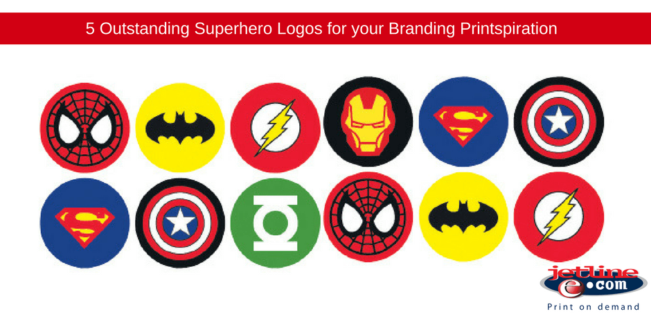
We should begin with the first superhero logo to ever be trademarked. DC Comic’s Superman is the world’s original superhero, making his first appearance in 1938. This stoic character was introduced to the world sporting the classic “S” logo. The iconic logo was created by Joe Shuster and Jerry Siegel.
Originally, the logo was a simple yellow and red police badge or shield. However, as superman’s popularity grew, the logo went through some changes, until the creators finally settled on a logo design – the large “S” inside of an inverted pentagon.
We all know that colour is an important part of branding, and the designer chose to stick with a primary yellow and red palette. These colours are powerful, strong, and confident (perfect for the character of Superman). But the colours also represent more than meets the eye. Superman’s home planet Krypton is red, while superman’s source of power comes from Earth’s yellow sun.
Then there is the logos diamond shape, which is bold and masculine in its presentation. Just like the colours of the Superman logo, the shape emotes strength, courage, and power.
A lot of thought and consideration went into the design of the logo, and this is why it works. It was in 1945 that the logo was trademarked, which kicked off a profitable merchandising market for the Superman brand, with the Superman logo printed on posters, stickers, caps, t-shirts, and just about anything you can think of.
Wonder Woman


With the success of the new Wonder Woman film, we have to mention the incredible logo that goes along with the brand. Wonder Woman made her prolific debut in 1941. At the time, her emblem was an eagle and her name was scrawled in an open script on the cover of the comic.
It was only in the 80s when DC chose to invest in the character, that the female warrior was given a distinct superhero logo. Thinking in terms of merchandising opportunity, the designers knew they couldn’t easily trademark the symbol of an eagle for Wonder Woman – after all, the Eagle is a symbol of the USA.
Legendary graphic designer Milton Glaser took on the task to redesign Wonder Woman’s logo. He took the two “W’s” from her name and stylised them, turning them into a winged motif that celebrated the heroines flying superpower, which was also a subtle nod to the original eagle design.
Captain America


Unlike Superman, Captain America is a superhero from Earth, an enhanced super soldier to be precise. With an unconditional love for his country, the colour palette and design of Captain America’s brand had to be related to his homeland – America.
Captain America’s shield is the most iconic part of his branding, and surprisingly, it was originally a triangular shape! There were complaints about this by a rival comic book publisher and the shield was similar to one of their characters logos. The shield then evolved into its current circular shape.
With its central star, red, white, and blue circles, the shield emotes an all American patriotic feel, a not so subtle nod at the American Flag.
As much as the Captain America brand is a reflection of America and the American flag, it still maintains its own identity, exactly what a brand should do! You may be inspired by an already existing design, but it is imperative to make it the brands own.
The Punisher


From vibrant superheroes, to one of the darker and more violent vigilantes, we take a look at Marvel’s The Punisher. The logo, designed by Romita Sr, perfectly encapsulates the dark side of the character, with its menacing white skill peering out of the blackness. The logo is intimidating – perfect for scaring off the characters enemies. No one wants to get stick in a dark alley with someone wearing that design!
The Punisher logo isn’t just about its shock factor, it serves a practical function for the anti-hero, drawing fire away from his vulnerable areas and pointing it toward his most armed area – his chest.
The skull has gained mass cult appeal in the last decade or so, specifically in the USA Armed Forces. It actually appears on unofficial patches and has been spray painted onto vehicles and buildings in Afghanistan and Iraq. The logo has started to transcend fiction and has gained real-world notoriety.
This is the power of design and branding.
Batman

Much like Superman, Batman’s logo is perfectly suited to emphasise his physique, as its oval form is stretched across his broad chest. The logo has a number of uses in the comic and features prominently. It is the silhouette that lights up the nights sky from a giant searchlight (the bat signal) summoning the character to battle, and the logo also appears on many of Batman’s weapons and tools including his belt and Batarang.
The distinctive bat is the central focus of all Batman branding and the logo has undergone many changes over the years, from the books original logo in the 1940s, to the over the top design of the 60s, the Frank Miller’s darker Batman graphic novels of the 80s.
You see, successful branding is about understanding the target market. As opposed to Superman’s uplifting, colourful logo design which emotes a sense of hope, Batman’s logo is moody, mysterious, and threatening – designed to strike fear in the hearts of criminals.
JETLINE: PROFESSIONAL GRAPHIC DESIGN AND PRINTING COMPANY
Your logo forms the foundation of your brand and brand identity. It is what is seen on all your marketing materials, from your business cards and packaging through to your corporate stationery and social media platforms.When the consumer views your logo design, they should immediately recognise your business and service/ product offerings.
Designing a logo is not an easy process. It takes strategic thinking, testing, and a professional graphic designer.Looking to create an effective and eye-catching logo for your company branding? One that will work across all your branding platforms, from print to digital marketing?
Contact our graphic design, print, and branding experts today.
Find your closest Jetline branch here.

