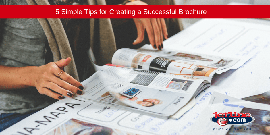
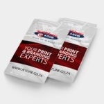
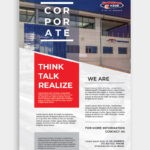
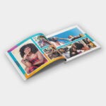
How do you make your brochure stand out and draw the eye of your audience effectively? As a leading printing company, we are here to help you get the most out of your print marketing!
Take a look at these top brochure design tips:
1. Begin by Understanding your Brochures Purpose
What message do you want to give with your brochure? Are you educating your audience about all your products and services? Are you focused on a new product or service offering? Or are you wanting to create brand awareness? Do you want to attract potential customers? Do you want customers to call you or walk into your store?
Clearly define your objectives. Once you know your message and your ideal call to action, you can begin the design and content creation process.
2. Limit your Fonts
Stick to your business’s corporate identity when designing a brochure. Find out what fonts the company uses and make use of those in your design. Ignoring a corporate identity in your design will only confuse the reader and make your brand seem unreliable.
A brochure doesn’t need a lot of fancy fonts. A simple heading, sub-heading, and body copy font is enough. The biggest problem with brochure design is that many young designers believe they need to get super creative with typography. The problem with this is that the design will look disorganised, making the brochure frustrating and difficult to read – an in turn, will make your business seem disorganised and frustrating.
3. Consider your Paper Stock Carefully
Speak to your printing company about the range of paper stock and finishing options available, don’t be boring with your design! There is nothing worse than a flimsy brochure that tears easily. There are many options available to prevent wear and tear!
You need to consider the size and shape of your brochure. Are you going to stick to a standard A5 brochure or are you going to get creative with a uniquely cut shape? Your professional printing company will be able to guide you on the best choice to make for your brand.
4. Copy is Key
Your brochure copy should never be undervalued when it comes to designing your brochure.
At the beginning stages of your brochure design project, experiment with the copy and its placement. Figure out if the copy provided needs reworking to fit into the space and don’t just drop in the headers at a later stage!
5. Keep your Statement Simple
If you want your brochure to stand out and relay its message effectively, it is best to keep it simple. Sometimes the simplest ideas are the best ideas! Don’t overwhelm the reader with too many images, graphics, and words.
The goal is to get your message and your brand identity across quickly and effectively. You don’t want to frustrate your reader with too much information. If they find it difficult to navigate the way through your brochure because the content is too heavy – they won’t read your brochure.
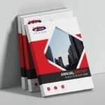
A great way to keep your brochure simple and eye-catching is to have a typographic cover that makes a very literal statement, passing on your message effectively. This may sound boring, but the right design, paper stock, graphics, and brand colours can make a massive statement.
SPEAK TO YOUR BROCHURE DESIGN AND BROCHURE PRINTING EXPERTS TODAY
Brochures are one of the most effective marketing tools. This tangible interaction has the power to create a strong connection with clients and potential clients alike. If you are interested in creating effective brochures for your company, they need to reflect your business message and brand, tell your story and immediately draw the eye.
It is vital that you work alongside an experienced branding company and printing company to help you create a brochure that will convert. Contact our design, branding and print professionals today and deliver a powerful brochure print campaign.

