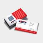
Your business card design and business card printing should never be a side thought to your marketing plan. Your business card often works as the first point of contact between a potential customer and your company. It needs to be strategically thought-out and designed in a way that encourages them to want to know more about you and your service offerings.
If you want to create an eye-catching, distinctive and professional business card, it is important to work alongside a professional business card designer and business card printing company.
Take a look at these top tips for business card success:
The 4 W’s
Who? What? Where? Why?

You may want to roll your eyes at how obvious this is, but it has to be mentioned. It is the most important part of your business card! This is the key information that you want to convey to your audience. Ensure that your name, company name, logo, job title and contact information is clearly displayed on your card.
Think carefully about which contact details you would like to give out. You need to strike a good balance between offering enough point of contacts without making the card too cluttered. With years of experience in business card design and business card printing, we suggest you include: your email address, work number and website address.
Typography for Readability
Don’t be tempted to minimise the size of your text because you want to add more information. Rather leave out some of the unnecessary details to ensure a readable business card. A smaller font may look perfectly acceptable when you look at the design on a screen, but your business card will be printed.

The general rule is to not go smaller than 8pt. Another aspect to look at is the typography iteself. What font are you going to use? Keep it simple and easy to read. Your business card is no place for calligraphy or the dreaded Comic Sans typeface. In fact, Comic Sans has no place anywhere…
Black and White or Colour Business Card Printing
Colours certainly give your business card an eye-catching advantage over a typical black and white print. If you are going for colour, make sure you only use colours that are in-line with your corporate branding. Again, this may sound obvious but it is critical.


However, brightly coloured cards should only be used by businesses that embrace a creative company culture. It would make sense for a digital agency to put together an eye-catching colourful design, but would it be applicable for a law firm? Probably not.
In the same breath, never underestimate the power of simplicity.
A simple black and white business card is often viewed as classy, professional, minimalist and stylish. To create this classic look, it is important that you work alongside an experienced graphic designer and printing company. This is not something you can just design in Word.
Emboss like a Boss
If you are worried that your plain black and white design may appear too static, look into creating a fun, raised 3D effect. This is done by embossing your cards. If your business embraces style, class and elegance, than this is an excellent design choice for you.


Not only is an embossed card aesthetically appealing, it also makes it more tactile and engaging. The more engaging your marketing material, the more your potential clients will remember your business.
Keep it Visual
A picture is worth a thousand words. As we mentioned previously, you should never fill your business card with unnecessary information. It needs to get straight to the point. Yes, you need to have some text on your card but you don’t want to overwhelm the viewer.

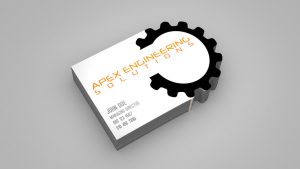
Leave some space for something visually appealing i.e: An image of your product or something related to your business. Think about placing this on the back of your business card, this is also a great space to boldly display your logo.
Paper Choice
It is important to consider the thickness of your business card. Stronger, thicker and more durable cards feel more expensive and professional, while thinner paper makes them feel cheap and somewhat tacky. Think about your card as your handshake – it should be strong.

Plus, you don’t want your business card to rip apart when it is placed in a potential client’s wallet…
Jetline: Printing Company South Africa
As a leading printing company South Africa, Jetline offers the highest quality business card design and business card printing solutions. Take a look at our business card promotions here and contact your closest Jetline branch for more information here.
Time to get networking!


