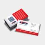
First impressions count and this is especially true in business. A professionally designed business card lends a sense of legitimacy to your business. A strategically designed business card also has the power to help you stand out from your competitors.
Take a look at these business card design tips and get networking!
Design Best Practice
Your business card design needs to stick to the basic principles of paper-based design. So, what exactly are these principles?
- Make sure you design your business card using CMYK to maintain legibility and colour consistency. Many graphic designers that are used to working digitally have become accustomed to working in RGB and forget that print requires colours to be in CMYK.

- Ensure that the font you choose is legible and easy to read. Consult your printing company to gain greater insight into this and remember that you don’t want to make your business card a difficult read for potential clients. And if your card is hard to read, it will be thrown in the trash.

- Your business card copy should be at least 5mm from the trim edge as this prevents it from being cut off during the printing process.

- Design at 300dpi to ensure the best image reproduction.

Be Creative while always taking your Brand Identity into Account
There are some standard sized business cards available. For example, one of the most popular sizes would be 90x5O. If you choose to go with a standard size card it is important to remember that you can still get creative even in a seemingly small space. This tiny piece of paper is your canvas and you can certainly make it stand out.
Begin by understanding what information needs to be included on your business card. This is typically your name, number, email address and web address. Try to include your social media platforms too.
Once you know what your copy is, design around it and present this information in an eye-catching way. Make sure to take your branding into account, i.e.: your company colours and your logo. Understand the personality of your business, your corporate identity and make sure that your design represents this ethos.
Avoid Common Mistakes
There are common mistakes that are made when it comes to designing business cards, specifically if you are not working with a professional print designer and printing company. You need to take the ‘bleed area’ into account when designing your card. The bleed area is usually 3mm but varies. So, make sure you understand what is required for your particular business card.

Another vital element of business card design is to avoid using a straightforward border around the entire card. This can easily show up misaligned in the trim if not perfectly cut. With this in mind, work closely with a professional designer and printing company to help guide you on this process.
Cost-Effective Finishes
Lamination is a cost-effective way to add that extra finish to your business card. Lamination refers to a liquid that dries paper, making it a dry surface or a tough gloss. Whether dry or glossy, lamination protects the surface of the paper effectively. Your printed material will be coated with weather resistant, durable, laminate finish. This ensures a resilient and attractive print material.
Make them Look Twice
Business cards are small, and by investing in double sided printing you double the space you have for text, graphics and visuals. This extra space helps you include relevant information about your business without making the card appear crowded with information on one side.

Make your Business Card Interactive with Cut-Outs
A smart way to ensure a unique and memorable business card is to make use of the die-cutting process. This cuts out elements from the card stock, changing the shape of your card from rounded edges to intricately cut out shapes in the center of your card.

Jetline Print on Demand
At Jetline, our team of designers will work with you to ensure the best end result possible.
Contact your closest Jetline branch and chat to one of our experts – time to get networking!

