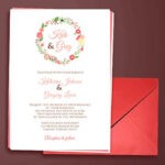
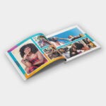
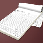
Print design is considered one of the most challenging aspects of design for a graphic designer. Many facets need to be considered when designing for print, from digital print production processes to print material specifications. Designers need to fully understand ink colour, bleeding edges, what files are compatible with what printer… the list goes on. There is more to print design than just pixels.
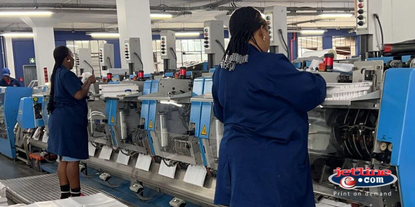
When working with a printer, it is vital to remember that a successful print job begins with laying out the document correctly and paying scrupulous attention to detail. Something as simple as not preparing the document to the final trim size can cause delays in production. While PDF’s are becoming the norm, sometimes it is helpful to send the native files through as a package from Adobe InDesign, embedding fonts and providing image links and other assets. The printing company is then able to place the printer in the best position to tackle any issues that may arise.
That is why it is imperative that you work closely with a professional print designer and printing company.
What Digital Designers can Learn from Print Design:
Audience Focused Designs
Print design is always focused on readability, much like web design focuses on User Experience. Taking the reader/user into consideration, it is important to design your page to ensure the viewer consumes content easily.
The “F” Pattern:

The “F” patter is the most common way a reader scans a page, be it printed or digital. The eye travels horizontally across the top of the page and then scans down vertically to the left side of the page. The most successful brochure, flyer and magazine designs use this proven reading pattern.
The “Z” Pattern:

Another popular option is the “Z” pattern. This is based on natural scanning. The reader/user scans the top of the page horizontally and then drops down to the left – repeating the same pattern until reaching the end of the page. This pattern is often found in newspapers and on well known blog pages.
Typography
Whether print or digital, the text should have a clear hierarchy. Type sizes are vital as key messages need to jump off the page. IE: “New Stock Arriving!” “Easter Sale” etc. This allows the reader to scan the page easily, consuming the significant message immediately.

This visual and typographical hierarchy forms order on the page and directs the reader/user accordingly.
Spacial Balance
From asymmetrical to symmetrical or radial, print and web design should always create a sense of balance, uniformity, and stability. If the reader/user is overwhelmed by cluttered text and visuals, they will stop engaging with the content. Print graphic designers understand just how critical it is to respect the spacing between the page elements. The use of negative space allows you to direct the eye of the reader.
The goal is to make the reader feel at ease when browsing through a catalog, brochure, or flyer. It is important to note that this principle applies to digital design as well, it is all about user experience, directing the user to specific information arranged strategically on the page.
Test all aspects of your Design
Every designer needs to make sure that their design is easy to read for the entire audience. Try not to use more than 2 fonts and keep them in the same typographical family. Print designers always triple check their designs, ensuring the information displayed is easy to consume and the imagery doesn’t overwhelm the eye of the reader.
This is why it is critical to work alongside a professional print designer and experienced printing company. As mentioned above, all design should be widely tested as some fonts may not be legible once transferred to the print medium. The same principle can be applied to web design as the designer needs to consider how the fonts and images will appear on all screen sizes, tablets, and mobile devices.
From RGB to CMYK

If you are designing a poster, brochure, flyer, or letterhead, any marketing material that needs to go through a printing company, make sure to work in a CMYK colour format, not RGB! You can easily switch to CMYK mode in photoshop, and this will give you a much more accurate idea of what your design will look like when translated from digital to print,
If you convert a RGB file into CMYK after you have designed your artwork, before you send it off to your printing company, you will notice that the blues and greens appear to be dull. This is why all designers should work in CMYK when designing for print. You can even highlight which colours will have difficulty when converting, by using Photoshop’s Gamut Warning Tool.
Size and Resolution Rules

Print files are always large. Any printing company will tell you that the most common delay in the printing process is low resolution. If a resolution is too low, the final result will be pixelated and blurred.
If you choose not to work with a professional print designer and make use of your in-house design team, they need to understand that the more printed Dots Per Inch (DPI), the higher the resolution, and ultimately the greater the quality of the print reproduction and duplication.
Bleed and Trim the Design

There are 3 main criteria in the printing model:
The Bleed:
The worst mistake you can make when designing for print is failing to add a “bleed” to the design. Certain specs are required for print companies. This is not because your printing company is being difficult, this is a vital part of the printing process. If you don’t design with a bleed, the entire print job can be compromised.
The Trim:
This is the simplest part to understand. The trim is the final size of the document and where the paper will be trimmed down to.
The Live Area:
This is the smaller space which is an important element of print design. It is usually viewed as bad practice to insert non-bleeding copy and images too close to the page edge. You need to provide the viewer with “visual breathing” room – and make sure it won’t get trimmed off the page! Essentially, the live area is a safety zone for you to insert the content.
Professional Printing Company South Africa
If you are looking to create an effective printing campaign, the key lies in strategy and working alongside professional print designers and an expert printing company.
Jetline caters to the entire printing process, from design through to installation.
Contact your closest Jetline store for all your design, printing, brand management and digital solutions.

