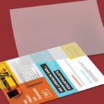
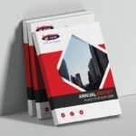
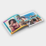
Realistically, when starting a business, time and money are limited. Brochure printing, flyer design, and print marketing are a proven, cost-effective way to promote your business and educate your target market about your offerings.
Here are a few tips to assist you in the brochure design and brochure printing process:
How to create an effective brochure for your start up:
Keep it Short and Simple
As a start-up, you may not have the capital to invest in a glossy 70 page brochure. You also need to remember that your target market is busy, so they probably won’t appreciate having the learn about your company through an overwhelming business manifesto. Your audience wants easy to consume information, content that is eye-catching, and most importantly – straight to the point.
Keep your brochure short and simple. 5 – 10 pages is sufficient.
Strategy is Key
Before you jump head first into the brochure design and brochure printing process, you need to strategise. Ask yourself what the main purpose of your brochure is.
- What is your call to action?
- Do you just want to inform your target market about your your brand?
- Do you want to direct traffic to your website?
- Do you want feet through the door?
Once you identify the primary purpose of your brochure campaign, you build content around it, strategically communicating your marketing goal to your audience.
Keep it Structured
Again, this comes down to strategy. You need to identify what information you want to showcase on each page of your brochure. Much like websites are made up of Home, About Us, Services, and Contact Us pages, your brochure should be well-structured, making it easy for the reader to navigate the content. Cut any information that is unnecessary and doesn’t add value to your brochure.
Once you have split this into sections, you need to ensure a clear Call to Action. Your contact details need to be made clear. Most readers will look at the back of the brochure for details. Your contact details should include: office number, address, social media handles, and web address.
Brand Maintenance
Your brand is your company’s promise. From the tone of your content, to the graphics of your brochure, make sure everything is in-line with your brand identity. Your brochure design is an aesthetic representation of your business philosophy and values.
Your brand identity would have been locked down when creating your logo, company colours, tag line etc. Your online and print marketing needs to be in-line with this, and this is how you become recognisable, make a statement, and build a loyal customer base.
Clean and Easy to Read
Whether your brand colours are muted or bright, your brochure print needs to be clean and uncluttered. Make use of negative space, don’t overpower or frustrate the reader with too much text and imagery!
Make use of bold fonts or text boxes when highlighting your page headers. This makes the content easy to read, navigating the reader through the content with ease.
Check, Check and Check Again
This goes without saying! Always check your spelling and grammar! Also make sure that there are no inconsistencies in your content. For example: check for any inconsistencies between UK and US English. A single mistake can ruin an otherwise professional brochure.
It is almost impossible to proof read your own writing. You need a fresh set of eyes to assist in this process. If you can’t afford a professional proof reader, pass your content to a few people that you know. It comes down to proofing, proofing, and more proofing!
Compelling and Concise Content
Your content needs to be concise and clear. Avoid unnecessary adjectives. Try keep your descriptions short and to the point. Make use of bullet points, headings, and sub-headings. Your vocabulary choice needs to fit with your target market. Try to avoid industry jargon and keep your tine professional and conversational. The last thing you want to do is talk down to your readers.
You may want to include interesting facts and stats. This creates talking points and continues brand conversation well after the brochure has been read.
Go Big or Go Home
Large headers, big text, and big images work well in brochure design. This is because they draw the eye of the reader and make for less page clutter. Just because your pages are small does not mean that your text has to be minuscule. The last thing you want is for your reader to have to squint to get information. If this is the case, they will simply discard your brochure.
Professional Printing Company South Africa
If you are looking to create an effective printing campaign, the key lies in strategy and working alongside professional print designers and an expert printing company. Jetline caters to the entire printing process, from design through to installation.
Contact us today for all your design, printing, brand management and digital solutions.

