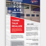
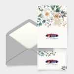
Brochure printing and brochure design continually evolves as technology and creative ideals change. Branding and printing companies are thinking outside of the box when it comes to print marketing, and are now crafting innovative brochures to catch the eye of the consumer.
Today, marketers understand the need for creative brochure design. All businesses, from large companies to small start-ups, have taken to designing and printing brochures that stand out with one of a kind design, texture and shape.
Today we offer up some tips for creating a successful brochure print campaign, ensuring that your brand message reaches your target market effectively.
Keep it Simple, Stupid
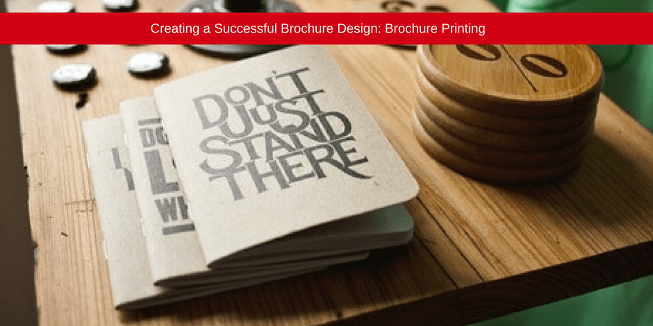
A simple, chic, modern design is always effective. Remember that simple doesn’t have to mean boring. Using embossing or letter press in a clean font, on a single colour background, certainly draws the eye and adds a sense of class to any brand.

Adding embossing to your brochure design gives an element of texture. This gives your marketing material an emotive and tactile edge, meaning that the viewer won’t forget your brand message any time soon.
Fun and Functional Brochure Design and Brochure Printing
Keep it functional. You need to give your audience an easy user experience. Add a bit of your own brand quirk to the design. The below brochure looks likes a regular brochure design, however the front page folds out to give the viewer a delightful visual treat.

This simple element makes the brochure interactive and memorable in a functional, simple way. You don’t want to overwhelm the viewer with a brochure that is too out of the box, unless your target market likes that kind of thing of course.
Shape your Brand
Want to add a little sass to your design? Geometric shapes make brochures inviting. Focusing on shapely cut-outs in Call to Action’s is a great way to draw the eye of the consumer.

Add a pop of colour to the design, place it against a neutral background and you really create something visually appealing. You can also cut out the shape, adding a 3D element of interest.
Line it Up
Brochures do not have to be thick and folded booklets that are bound at the center. You can have fun with your design, as long as it is still functional.

The latest brochure design trend is the linear design, an accordion shape print that allows a person to view the entire brochure as a whole. This is another interactive and tactile approach to print marketing.
Insert Some Fun
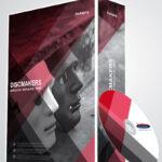
If you want to include a physical item in your brochure (CDs and DVDs are a nice element to add), make sure to display them in an interesting and accommodating way. You can have fun with this.

A professional brochure designer and printing company will be able to assist you with an effective design in this regard. You can have your CD pop out, or have it placed strategically in the middle of the brochure with content on the sides of the packaging.
Changes to the Norm
Simply by shaving down the typical rectangular brochure shape by creating rounded edges, you give a brochure an innovative and modern feel.


As this shape is slightly altered from the traditional brochure design, your audience will be made curious about its content. It is more inviting and warm, allowing you to play around with visuals and content dimension.
Die-Cutting is Eye-Catching
Die-cuts offer an opportunity to ignite imagination or work as a window to reveal little bits of content. A checker board die cut, as seen below, displays the visual in a fun way, making the viewer want to see what is behind the window.

The die-cut displays enough to understand what the image is and shows just enough to create curiosity in the viewer – spurring them to open and investigate the content.
Tantalize with Typography
Developing typography using photography or graphics is a creative way to entice the audience. The above brochure typography is reversed, showing the graphics as the words.

The above example is excellent because the graphics used in the typography are easily readable and the image is simple to make out. This definitely gives this brochure the edge and makes the viewer look twice.
Draw the Eye with Display Stands
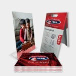
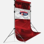
You don’t just want your brochure to lie around, you want it to be seen! Having your brochures strewn aimlessly across your table top is not a good look for any business. The best way to display your brochure effectively is to create a designated area for them. You can have a display stand printed to ensure that your brand identity is represented perfectly on the stand itself.

This kind of look makes for professional looking marketing.
Jetline: Brochure Design and Brochure Printing South Africa
Are you interested in creating an eye-catching brochure for your business? Your brochure needs to reflect your brand and business message, tell your story and immediately draw the eye of your audience. It is vital that you work alongside an experienced brochure design and printing company to help you put together a brochure that is sure to get your target market talking.
Contact the print, branding and design experts today and be well on your way to print marketing success!

