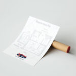
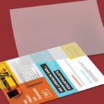
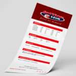
Whether your flyer printing is to promote a party or a new product, it needs to instantly grab attention. So, how do you stand out when it comes to your flyer design? Printing and artwork form the foundation of a successful flyer campaign.
Flyer Printing and Flyer Design Inspiration
Let’s unpack 3 important elements of flyer campaign strategy. That is: design, content, and implementation.
Design
Grab Attention
So, you are grabbing your morning caffeine fix from your favourite cafe and as you rest your arm against the counter, something catches your eye. It’s a flyer for a music festival. Even though you are in a rush to get to the office, something still made you stop and take a moment to look at the flyer.
So what exactly made you stop and look at the flyer? It was most probably something visual i.e: shapes, illustrations, colours, or unique typography. The bottom line is that flyers are all about design because a flyer has to actually be noticed to serve its intended purpose.
Grab attention with these design techniques:
-
A Clear Focal Point
Every graphic designer knows that all marketing designs, whether print or digital, needs to have a focal point. This is the part of the design that draws the eye in. Your focal point can be anything you choose – a header, illustration, or typography. Always make sure your focal point directs the viewers eye to your key information.
-
Relevant Visuals
Imagery plays an important role in most flyer designs, whether these images are graphics, photographs, illustrations or icons.
Flyer Printing Design Tip:
Make sure that the images you use are of high quality and a high resolution.
-
Appropriate Typography
Typography/fonts play a vital role in all marketing materials. It is rare for a design to communicate a message effectively using only visuals. When choosing a font for your flyer design, consider the brand, audience, and context. And of course, readability!
Colours
A splash of colour works to grab attention. This is just one aspect of colour in design and marketing. Colour theory is complicated, but we will strip it down to the basics. That is: colour has the power to elicit emotions and feelings in the viewer.
For example: blues and greens are nature-inspired and calming while red and orange hues evoke energy, passion, and excitement. Consider what colours will enhance the message of your flyer.
Flyer Printing Design Tip:
If colour printing isn’t in your budget, you can always print on colour paper stock. You can also take advantage of black, white, and grey by playing on gradients and contrast.
Balance
Nothing screams “look away” louder than a busy, untidy flyer. If there is too much information – cut it down! If it is impossible to make all the content space well on the page, and you cannot remove any information then add an extra page or two!
Always space your content well, giving the eye something tidy to look at. This means that your audience will retain the information provided because it is easy to read.
Make use of white space. That is: areas without any words or graphics. Don’t ever think of blank spaces as wasted space. These spaces help guide the eye to the relevant content. Essentially, they are road-maps to information.
Flyer Printing Design Tip:
Consider bleed areas, margins, and alignment in your print design. This will help you organise your layout effectively.
Content
While the visual element of your design is the first thing to catch the attention of the audience, the copy is what keeps them interested – and what gets your message across! Below are a few tips to help you on your flyer copy-writing strategy.
Strategy
Before you even begin placing copy into your design, do some serious planning. Ask yourself what information is vital and what would just be taking up valuable space?
This kind of strategic thinking will help you narrow down your ideas, identifying your key message and making sure you stay on point in your design. This will also allow for room for white space, creating a neat, easy to read design. Because flyers have limited space, you want to be as straightforward as possible, always keeping to the key message.
Simple.
Content Strategy is Key
Before you even begin placing your copy into your design, do some planning. Ask yourself what information is vital and what would just be taking up valuable space?
This kind of thinking will help you narrow down your ideas, helping you identiy your key message. This will help in leaving room for white space, creating a neat, easy to read design. Because flyers have limited space, you want to be as straight to the point as possible always keeping on brand message complete with a strong call to action.
Priorities and Organisation
Once you have decided on the information you will use in your flyer, it is time to organise it in a way that is easy to read. This is where typographic hierarchy comes in. This refers to arranging the text so that the viewer knows where to look for information. There are many ways to organise your text.
- Font weight and style
- Font size
- Bullet points
- Text boxes or colour blocks
- Underlining or arrows etc.
- Placement and spacing
- Alignment
Strategic Marketing and Implementation
Branding
This should go without saying. If you are designing a flyer for a specific brand, it is vital to integrate the brand identity into the flyer. Make sure to use the brand style guide. Learn what fonts, colours, and logos are approved by the brand and work with them!
If the business you are designing the flyer for doesn’t have an official style guide, look at their other marketing materials, website, and social media pages. You will gain an understanding of the brand personality and look and feel through these mediums.
Call to Action
Now that you have gotten your copy and design down, it is time to seal the deal. The Call to Action is the most important part of your flyer. The goal of any marketing material is to get your audience to take a specific action. Whether this be to email you, walk into your store, purchase a product online, or RSVP to an event.
Make sure that your audience is made aware of the action, and tell them how to take the action!
Distribution
Your flyer printing has been completed and now it is time to get them to your target market. This can be done through direct mail, in-store distribution, side of the road handouts or drop-offs at certain places frequented by your target market.
You can also distribute your flyers digitally through an email marketing campaign, or publish it on your website as a blog! The options for distribution are endless!
Jetline: Flyer Design and Flyer Printing Company
Flyers are one of the most effective marketing tools. It is important that you work alongside an experienced branding and printing company to help you create a flyer that will convert leads into clients.
Contact our design and print professionals today!
Find your nearest Jetline store here.


