Have you ever received an email that seems unprofessional but you can’t exactly pinpoint why you have a bad feeling about it? Well, it may lie in the email signature – or lack thereof.
An email signature is more important than most give it credit for as it is a way to grab the attention of the receiver and make sure they remember who you are, and what your business stand for.
But you may be asking yourself if you really need one – and the answer is a resounding yes! You have to have an email signature if you want to be taken seriously and viewed as a professional. Also, this is the perfect place to promote your brand one last time in your communications – so why not just go for it?
Now that we understand why you need an email signature, lets take a look at how to create an effective one.
The Dos and Donts of Email Signatures
-
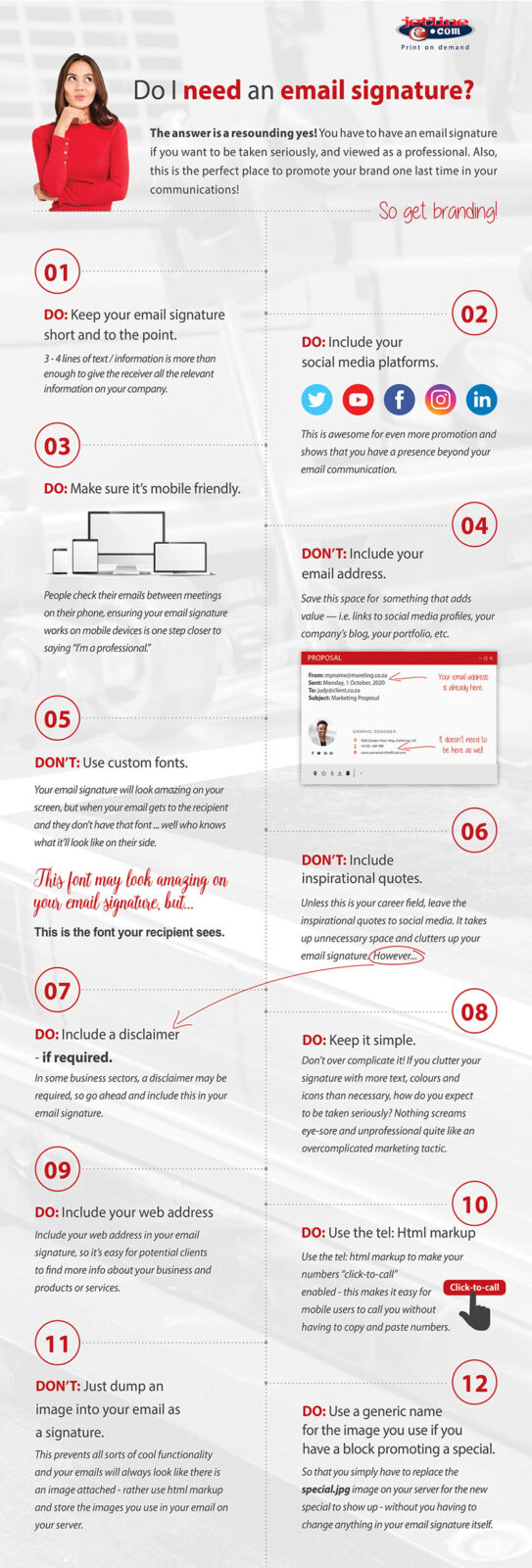
- Do make your signature short and to the point, 3 – 4 lines max! Also always add your social media icons and links to your platforms and this offers even more opportunity for brand promotion and shows that you have a presence beyond simple email communication.
- Do make your email signature mobile friendly. Think about it like this – you are probably reading this post through your mobile device, and we can guarantee you that most of your email recipients are checking out your email through the same device.
- Do include your web address in your email signature, so it’s easy for potential clients to find more info about your business and products or services.
- Do use the tel: html markup to make your numbers “click-to-call” enabled – this makes it easy to for mobile users to call you without having to copy and paste numbers.
- Do use a generic name for the image you use if you have a block promoting a special – so you simply have to replace the special.jpg on your server for the new special to show up – without you having to change anything in your email itself.
- Don’t over complicate it! If you clutter your signature with more text, colours and icons than necessary, how do you expect to be taken seriously? Nothing screams eye-sore and unprofessional quite like an overcomplicated marketing tactic.
- Don’t try to get over creative. Make sure to use fonts and colours associated with your brand and keep things as cohesive as possible. It is important that you also make sure to use a universal font that is available on all devices as a customised font may not be seen on all devices. Also, this is not the 90s anymore folks, so no more motivational quotes and extra fun elements. Your email should be professional, brand aware and straight to the point.
- Don’t just dump an image into your email as a signature – this prevents all sorts of cool functionality and your emails will always look like there is an image attached – rather use html markup and store the images you use in your email in your server.
In conclusion
An email signature with a strong design provides all the information with an effective hierarchy and maintain clear brand communication.
It also needs to use consistent fonts and font colors and never forget that most of your recipients now read emails on smartphones, so your email signature needs to be responsive.

