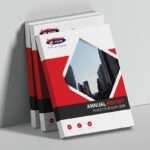
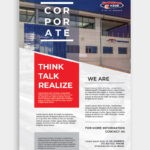
As brochure printing evolves and becomes more creative and technologically advanced, marketers need to think outside of the box. They need to craft innovative brochures to effectively showcase their brand.
Brochures are usually 20 pages long, designed with an eye-catching cover and brand related imagery. This style can become boring, but there are ways to make your brochure stand out from the rest.
Today, all businesses, from start-ups to large corporations are developing brochures that stand out with one of a kind design, texture and shape.
How do you ensure that your brochure has that much needed je ne sais quoi?
Brochure Design and Brochure Printing Ideas
Origami/Folded Paper

Not only is this cost-effective, it is interactive. By providing your target market with an interactive brochure design, you are physically connecting with them. And don’t worry about fitting information into the design. Work with a professional print designer and printing company and the process will be seamless.
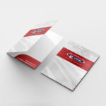
Corporate Folder and Loose Leaf Inserts

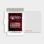
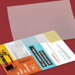
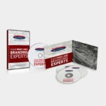
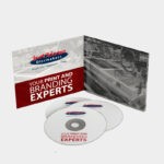
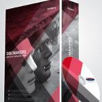
By combining a corporate folder with loose lead inserts, you create a fashionable element to your marketing design. You also have the opportunity to provide clients with little extras such as DVDs, postcards, business cards – the works! By adding loose leaf inserts you are able to customise your brochure to suit the particular client, providing them with elements that are only relevant to them.
Not only are you giving your clients information that is relevant to them, you are saving costs! You can also extend your marketing campaign through this design by sending your clients new inserts to add to their corporate folder, ensuring they keep going back to your brand information.
Die-Cuts/Cut-Cuts

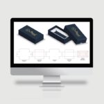
Die cutting adds an awesome visual element to a brochure, And when used alongside a strategic layout design, it is incredibly effective. This technique is usually used on the front covers of brochures but if you get creative, you can apply it to the body of the brochure as well.
Tabs

By simply adding colour coded tabs to your brochure, you make your information easy to navigate. User experience is key to successful content! By combining tabs with bright colours and eye-catching typography, you make the design that much more aesthetically appealing, drawing the eye of the reader effectively.
Shapely

Of course the typical square or rectangular brochure is the norm. So why fix something that isn’t broken? Well, it is always nice to break out of the box once in a while! An oddly shaped brochure creates a talking point, thus increasing brand awareness.
Binding

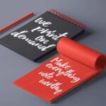
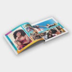
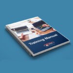
By choosing a binding method that is out of the ordinary, you generate a powerful first impression. As the majority of brochure prints are perfect bound or saddle-stitched, a binded brochure will catch the reader’s eye immediately. From spiral bound design to threading, the options are endless.
Speak to your professional brochure printing company to assist you in your choice.
Professional Brochure Printing Company South Africa
If you are looking to create an effective brochure printing campaign, the key lies in strategy and working alongside professional print designers and an expert printing company. Jetline caters to your entire printing process from design through to delivery.
Contact us today for all your design, printing, brand management and digital solutions.

