When it comes to graphic design for print, what you design on-screen needs to be reproduced accurately on paper. Follow these tips and you will be designing for print with confidence!
From RGB to CMYK

If you are designing a poster, brochure, flyer, or letterhead – any marketing material that needs to go through a printing company, make sure to work in a CMYK colour format, not RGB! You can easily switch to CMYK mode in Photoshop, and this will give you a much more accurate idea of what your design will look like when translated from digital to print.
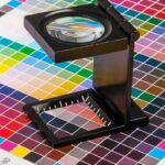
If you convert a RGB file into CMYK after you have designed your artwork, before you send it off to your printing company, you will notice that the blues and greens appear to be dull. This is why all designers should work in CMYK when designing for print. You can even highlight which colours will have difficulty when converting, by using Photoshop’s Gamut Warning Tool.
Size and Resolution Rules

Print files are always large. Any printing company will tell you that the most common delay in the printing process is low resolution. If a resolution is too low, the final result will be pixelated and blurred.
If you choose not to work with a professional print designer and make use of your in-house design team, they need to understand that the more printed Dots Per Inch (DPI), the higher the resolution, and ultimately the greater the quality of the print reproduction and duplication.
Typography Tips

Struggling to find a font? If you have ever downloaded a font, you will notice that they come in 2 categories, those being: web fonts and desktop fonts. These terms relate to licensing, and any issues with copyrighting.
Generally, desktop fonts are licensed to a single user, allowing the user to download the font to their computer. These particular fonts are often used in print design. Now that the legalities are out of the way, let’s take a look at the creative process…
Many typefaces look terrible in large amounts of copy, however, many designers struggle to see this translated from digital to print. Making use of a headline font for the body of the content may seem cool, but when this is translated to print, the design will completely overwhelm the viewer.
Digital and print landscapes have their own boundaries. In print, you have to deal with mesh count and trapping, and then decide on the level of detail you can use. This is especially important for engraving and letter pressing.
Establishing a hierarchy in the copy is vital. Defining styles, choosing typefaces, choosing body sizes, and establishing the relationship between elements on the page, is part of the design process. Envision the hierarchy of your page as a conversation, make the most important elements stand out, and intersperse the body with visual reminders of the “conversation” that is happening between the reader and the brand.
When you want to accentuate a certain text on a page that is filled with copy, make use of bold small caps. By using this technique you make the chosen text subtly stand out, without frustrating or confusing the viewer.
Make sure to run a pre-print check. If you are using InDesign, this is called a “Pre-Flight.” By running a pre-print check, you will see if there are any issues.
Bleed and Trim the Design

There are 3 main criteria in the printing model:
The Bleed:
The worst mistake you can make when designing for print is failing to add a “bleed” to the design. Certain specs are required for print companies. This is not because your printing company is being difficult, this is a vital part of the printing process. If you don’t design with a bleed, the entire print job can be compromised.
The Trim:
This is the simplest part to understand. The trim is the final size of the document and where the paper will be “trimmed” down to.
The Live Area:
This is the smaller space which is an important element of print design. It is usually viewed as bad practice to insert non-bleeding copy and images too close to the page edge. You need to provide the viewer with “visual breathing” room – and make sure it won’t get trimmed off the page! Essentially, the live area is a safety zone for you to insert the content.
Professional Printing Company South Africa
If you are looking to create an effective printing campaign, the key lies in strategy and working alongside professional print designers and an expert printing company.
Jetline caters to the entire printing process, from design through to installation.
Contact your closest Jetline store for all your design, printing, brand management and digital solutions.


