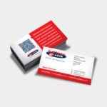
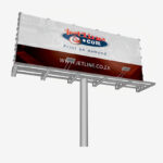
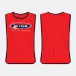
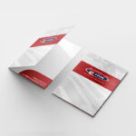
As a professional branding and printing company, we know that your logo is the face of your business. It should encompass every element of your brand identity and express your corporate personality. Every aspect of your logo needs to be taken into account, from colour and font to size and slogan. Your logo appears on all your marketing materials. This includes your website, brochures, packaging, and all your communications platforms.
A logo cannot be clip-art or a copy and paste job. Creating the perfect logo needs to take time, strategy and dedication. It is the most important element of your brands graphic design.
To keep you inspired, we take a look at the history of some of the world’s most recognisable logos.
Michelin

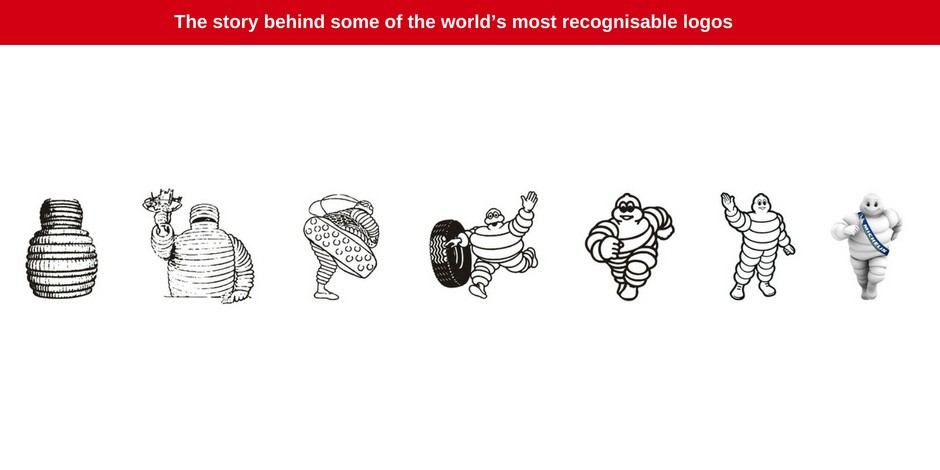
The logo for this company has always been the good ‘ol Michelin tire man. And everyone knows the Michelin man!
The design itself was inspired by a pile of tires that founder Edouard Michelin walked by. When he looked at the tires he saw the shape of a person. Michelin then spoke to his marketing and graphic design company (O’Galop) about this creative vision. The creative team at O’Galop took this idea and ran with it.
The Michelin logo was introduced to the public in 1898 and an iconic image was born.
Goes to show you that imagination really can take you places!
Goodyear

Goodyear was founded in 1898, and its iconic logo was introduced to the public in the early 1900s. In 1900 Goodyear chose the Wingford symbol to represent their brand after founder Frank Seiberling became inspired by the statue of Greek God – Hermes.
The “winged” symbol expressed quick service and speed. An excellent expression of the qualities that the company stands for. Since the logo was introduced in 1901, it has stayed relatively unchanged.
Barbie

Barbie has been a part of pop culture since 1959. The brand is a subset of Mattel Inc, a toy manufacturing company that was established in 1945. When Barbie was introduced to the market, the doll hit the industry with a bang. Every aspect of the toy was taken into consideration before its launch, including the logo design.
The bright pink and eye-catching logo design was targeted toward tweens and marketed as the “teenage fashion model” doll.
Being such an iconic brand and having sold over 1 billion units, the Barbie logo hasn’t needed to change all that much. The biggest changes occurred on Barbies 50th birthday, when the profile of the doll wearing a ponytail was added to the logo design.
Audi

You certainly can’t have a blog about iconic symbols without referencing Audi. The company launched in 1909 and its logo was introduced in 1919. The Audi logo has changed with the times, evolving alongside the market.
The logo was amended in 1923 and then again in 1994, and once more in 2009. Hard to believe that the iconic rings of the logo only came into existence in the 1930s! But what do they actually mean?
Well, the great depression massively effected the company in the 30s. During this time, Audi merged with DKW, Horch and Wanderer to cut down costs. The 4 interlinked rings symbolise the unity and coming together of these companies. The design still lines the front grills of all Audi vehicles to this day!
Hewlett-Packard

Hewlett-Packard was founded in 1939. Since its inception, the logo has remained largely unchanged. In 2011 there was buzz in the industry and talk of simplifying the logo, but this was just a rumour. To this day the logo still uses a rounded font and the brand lives by the principle, “If it ain’t broke – don’t fix it!”
World Wildlife Federation

The World Wildlife Federation or WWF was founded in 1961.
The logo is often referred to as the world’s cutest logo – and for good reason! It is hard to one up a panda in the cuteness stakes. The logo was originally introduced with just the panda design and not font. It was in 1978 that the panda illustration was simplified – eliminating unnecessary texture from the design. The design was simplified once again in 1986.
This is a great example of “keeping it simple,” when it comes to logo design.
LEADING PRINTING COMPANY AND GRAPHIC DESIGN COMPANY SOUTH AFRICA
It is vital that you work with a professional graphic designer, printing company, branding company and digital agency when it comes to creating the ideal graphic design for your brand. They work with you, guaranteeing that your corporate identity, mission and vision and target market are fully represented in your brand design across all your marketing materials.
When customers and potential customers walk by your billboard or come across your brand online, they should immediately be able to identify your business because of its design. The key to successful brand graphic design and logo design is to create an aesthetic that works well on all platforms while fully embracing the identity of your business.
Jetline offers graphic design, printing and digital services.
Contact us for all your design, printing and marketing solutions.

