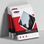
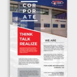
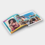
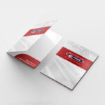
A great brochure clearly and concisely outlines what your business provides and what you offer your target market. As a leading brochure printing company, we offer some tips to help you design a brilliant brochure for your business.
Understand your Objective
To ensure an effective brochure design, you need to fully understand the purpose of your brochure. Is it to promote a specific product, a business in its entirety, or to get people to attend an event? This understanding will point you in the right direction.

Everything that you place in your brochure needs to clearly communicate its primary purpose to the audience. Once you understand what your brochure’s purpose is, you can begin finding the right design and content for it.
Know your Client
When designing a brochure, you need to understand the target market.
For example: If you are targeting soccer fans, pick a design that has something to do with sport. Maybe your brochure is shaped like a soccer ball? Maybe the lingo is soccer related?

The more you pinpoint and display the wants and needs of your target market on your brochure, the more effective it will be.
Be Unique and Creative
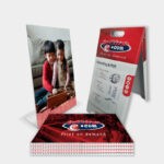
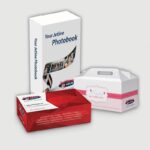
Creativity is what will set you apart from your competitors. Aim for a design that is unique. You don’t have to stick with a run of the mill, rectangular brochure.

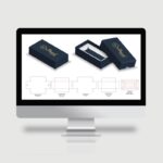
Today, printing companies offer a service known as die-cutting. This means that they can cut your brochure into any shape or size of your choice! Then there is your paper stock, colour, and finishing options. The opportunity for creativity in brochure design is almost limitless.
Speak to your printing company to find out what products they offer to make sure your brochure stands out!
Typography and Fonts
When you begin designing your brochure, it is very easy to get caught up in the excitement of it all. Sometimes graphic designers get so caught up in the creativity of it all, that they go a bit overboard in the font department.

When it comes to choosing the right font for your brochure, show restraint. If your company already has a signature font, then work from that. It is important that you don’t stray from the brands look and feel.
You can have fun with the headers of course, but make sure they are readable. Don’t ever pick a font that is difficult to read. The target audience will just toss the brochure away if that’s the case.
Get Straight to the Point
Don’t provide too much information. It is unnecessary to list all your business achievements in a single brochure. Your client doesn’t need to know about every aspect of your business, product, or service. Too much information will only confuse and overwhelm the reader and weaken the primary objective of the brochure.

Instead of filling your brochure with as much information as possible, focus on what information will grab the attention of the target market.
Avoid Industry Jargon and Big Words
The more complex the language you use, the less credibility you will have. No one likes to feel as if they are being spoken down to. You don’t have to impress your audience with fanciful words. Big words will only distract from your main point anyway.

When it comes to a brochure, simple language is the most effective route to take. This makes the content easy to read and navigate.
Design for your Target Audience
One of the struggles of the graphic designer is to prioritise the design for the reader. As a graphic designer, you need to think from the perspective of the brands target market.

For example:
If the audience reacts positively to certain colours, make sure to incorporate those colours into the design (if this is in-line with the brand identity of course.)
If the audience is a creative bunch, a run of the mill rectangular brochure probably won’t do. Maybe a fold out brochure would be a batter option?
You have to think like the audience and give them what they want.
Headline Matters
The headline of a brochure should tell the reader exactly what the content is about. For example: if it is advertising a specific product, the headline should convey the product being offered and what it can offer the reader. This is an immediate introduction to the content of the leaflet.

One of the biggest mistakes a business owner can make is to flood their brochure headline with company information. This is too broad and takes away from the primary objective of the brochure. Of course, business details are needed, but they don’t need to be highlighted as the main header of the brochure.
This reiterates the importance of understanding the core message of the brochure and considering it in every aspect of your brochure design.
Call to Action is Key
No matter how well-designed your brochure is, if there isn’t a strong Call to Action, it will fail. You must direct your audience to purchase your product/attend your event etc. You need to call them to action!

This means you need to clearly direct them as to what to do. Whether it be visit the store, call a number, follow your pages on social media, or make use of a QR Code. Make sure that your Call to Action stand out!
Choosing the Correct Colours
This comes down to brand identity. Makes sure the brochure colours are in-line with the brand. If they are not, it will only confuse the audience.

However, if your brochure isn’t business related, do some colour research. What emotions do you want to elicit in the reader? Is it a fun event that you are promoting? What colours work with the “feel” or “vibe” of the occasion?
Don’t just go for any colour that you think looks good – it isn’t about you! It is about your audience.
Quality Paper Stock
A flimsy brochure is just as disappointing as a weak handshake. You need to make a good impression with your brochure. If you provide your target market with a cheap looking brochure, how can they trust what you are offering? Your business will seem untrustworthy and unprofessional. To make a positive impression, you need to consider the paper stock you will use.

Speak to your printing company to discuss your paper options, and what quality paper stock will suit your brand and your budget.
Appropriate Imagery
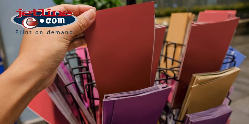
A brochure without pictures or graphics is just a boring piece of paper. People are visual and it is imagery that catches our eye.

To make your design more reader-friendly, add relevant photos or graphics associated with the primary theme of the brochure. Avoid using stock images, and say no to clip art.
SPEAK TO YOUR BROCHURE DESIGN AND BROCHURE PRINTING EXPERTS TODAY
Brochures are one of the most effective marketing tools. This tangible interaction has the power to create a strong connection with clients and potential clients alike. If you are interested in creating effective brochures for your company, they need to reflect your business message and brand, tell your story, and immediately draw the eye.
It is vital that you work alongside an experienced branding company and printing company to help you create a brochure that will convert.
Contact our design, branding and print professionals today and deliver a powerful brochure print campaign.

