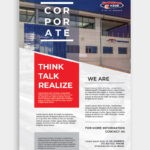
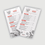
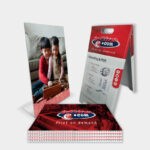
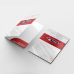
It is important to provide event guests with informative and entertaining event brochures. Finding the balance between creative and informative content is imperative when it comes to this design. Give your event visitors something to talk about when they pick up your brochure!
So, does your event require a brochure?
The events that benefit the most from brochure printing include:
- Lectures
- Concerts
- Theater Tours
- Literary Festivals
- Music Festivals
- Seasonal Events
- Store Launches
- Conferences/ Exhibitions/ Trade Shows
- Workshops
Even though these events may differ completely in audience and message, there are common aspects that your brochure printing project should include. Take a look at some of our top event brochure design tips:
Stay Covered


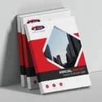
Regardless of the kind of brochure you are putting together, it needs to have an eye-catching front cover! This is how you encourage your guests to pick up the brochure and actively engage with the content. Make sure to use a strong, large typeface that is easy to read, striking colours (true to your brand identity, of course) and quality graphics/images.
There is no need for too much text. Just place a few choice snippets of information on the cover – enough to get the reader’s attention.
Content is King
When it comes to event brochure printing, it is common to create a brochure that has more than 3 sections of content. With this in mind, if you do put together a content heavy brochure, it is important to provide a “contents page” (creative index) or contents section.
You want to help the reader, not confuse them. And this kind of attention to detail immediately puts you, and your brand, in a positive light.
Block that Text
Brochures should contain a “block text,” an element of content that explains the background of the event, its mission and vision, and its philosophy (much like the About Us section of a website.) Make sure to include this in your event brochure printing. In regards to your content, consider your audience and the amount of text they are willing to read – will the viewer be reading your content fully or skimming through sections?
Create content that is easy to read. For example: bullet points help draw the readers eye and give them quick and easy information.
Floor-plans and Maps


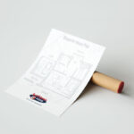
It is best practice to insert a visual to assist your visitors in navigating the event space. You can go all out in the design here – but the key is to keep it readable and easy to use! It’s great to get creative, but when you don’t take the reader into consideration, your design will be rendered useless.
You need to keep the design “clean” and well labelled. Use colour coding in the design to help the reader find the details they are searching for quickly and easily.
A professional designer and print company would also be able to make this design even more interactive, creating a foldout map and floor-plan – even with removable sections!
List it Up
Whether you are hosting a trade show and need to list your exhibitors, or you are hosting a party and need to list your sponsors, event brochures need a list of some sort. With this in mind, you need to design this section in such a way that it doesn’t overwhelm the reader. If you have really long lists, make sure to add a stylistic element to the design, such as colour coding and image placement.
Speak to a specialist brochure printing designer to assist you through this process. You can also inquire with your printing company about possible techniques such as embossing, to add a bit of pizzazz to the page.
The Event Schedule


A timetable is the fundamental point of your event brochure, consider dedicating one or two center spreads to your event schedule. As with floor-plans and lists, you need to take usability into account. Again, colour coding and innovative visual identity is key in the event schedule.
As with the floor-plan, you can get creative with this part of the brochure, making this a foldout section. The last thing you want is for the reader to disregard your schedule!
Call to Action
It is imperative that your contact details are clearly visible on your brochure. Make sure they are prominent and easy to locate. The back of the brochure is usually the place the viewer will look for this information, so make sure you have all the relevant information placed there – and if you want to get interactive, you can add a QR code. Here, you can also offer specials and sales, engaging the audience in continued conversation once the event comes to an end.
SPEAK TO YOUR BROCHURE DESIGN AND BROCHURE PRINTING EXPERTS TODAY
Brochures are one of the most effective marketing tools. This tangible interaction has the power to create a strong connection with clients and potential clients alike. If you are interested in creating effective brochures for your company, they need to reflect your business message and brand, tell your story and immediately draw the eye.
It is vital that you work alongside an experienced branding company and printing company to help you create a brochure that will convert. Contact our design, branding and print professionals today and deliver a powerful brochure print campaign.

