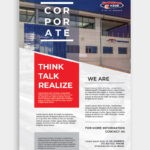
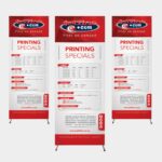
Thinking of making the ultimate poster to promote your business or event? This doesn’t need to be a daunting task. Our professional poster designers and poster printers are here to help. Your poster needs to reflect your message, tell your story and catch the eye of your audience. It is important that you work alongside an experienced designer and print company to help you put together a poster that gets your target market talking.
Take a look at these top poster design tips from the professional poster printers.
Easy to Read

The objective of your poster is to expose your audience to an event, sale or announcement. The primary information (your header and tagline) need to be easy to read from a distance, drawing the eye to the rest of the information – creating a hierarchy of information.
Split your information into 3 parts:
-
The Headline
The headline is the largest text in your design. Make sure to use a readable font in your design, of course you can keep the typeface interesting to demand attention, but make sure it is easy to read – especially from a distance.
-
Details
As with all marketing materials, you need to answer these 3 fundamental questions: When, What, Where. The second element of your text should do just that. Give you audience the answers in a concise and efficient way. When it comes to the sizing of this text, make it half of the headline size to display a clear hierarchy of information. This also makes the content easier to read as the viewer is not overwhelmed by text.
-
Fine Print
Fine print is usually seen on film posters, this is: the extra information about the people involved in the making of the film. It is also usually the place where event posters display the logos of the event sponsors.
Add Some Contrast

It is important to remember that you only have one chance to grab the attention of your audience. By adding a high contrast between your images and text, you make the information easier to digest. By adding a bright background image you will draw the eye – go with a bold colour, one that suits your brand message accordingly.
Size and Location

Where is your poster going to be located and displayed? Target market aside, you need to be aware of the elements surrounding your poster. This effects many aspects of your design including size, aspect ration and colour.
By taking location into consideration, your design decision will be made easier. Think about it like this: If your poster is going to be displayed on a bright red wall, you definitely don’t want to use a contrasting colour that will only make your poster an eye-sore in the space. If your poster is going to sit in an area surrounded by clutter, you definitely don’t want to create a poster with too many images – you want to put something in that space that stands out from the rest.
Call to Action is Key

What has your poster been created for? To invite people to an event, announce a sale, or to get traffic to your website? Make sure that your Call to Action (CTA) is prominent.
It is important that you have a strong CTA, ensuring that your audience knows what they need to do!
Jetline Print on Demand: Leading Printing Company South Africa
With branches throughout South Africa, we serve the general public, small, medium and large businesses and government institutions. The vast range of products and services we offer include: graphic design, full colour & black and white printing, corporate stationery, document duplication and binding (large quantities), PhotoBooks, banners and signs, posters, vinyl and contravision, vehicle branding, website design and much, much more!


