Graphic designers and any individuals in the creative sector, tend to view industry trends as negative. Of course, following trends blindly should be avoided, it is not a good idea to completely shut yourself off from what is presently popular. It is of course, popular for a reason. And you can always play on these trends, making them unique to the brand itself. And even if you don’t want to use any of these trends at all, it is always necessary to know what the industry trends are.
Here we take a look at the 5 graphic design trends that have taken center stage.
Simplified Graphic Design
Every designer is aware of the KISS principle Keep It Simple Stupid. While keeping designs simple is not a new concept, this year it has become even more widespread. This is because our lives are incredibly busy, and we are inundated with more content and advertisements than ever before thanks to the World Wide Web. Designers and branding companies have realised that it is vital to keep visuals to a minimum so as not to confuse or overwhelm the viewer.
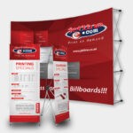
Another aspect is that nowadays designs need to not only fit print media such as brochures and billboards, they also need to translate on mobile screens and tablets. Essentially, if a logo doesn’t work once shrunken down to a few pixels, it is not going to be successful.
Most of the globes biggest businesses have taken to the simplified design trend this year. These brands include: MasterCard, Subway, HP, Instagram and Ministry of Sound.
Take a look at these simplified designs:
Deconstructing Typography
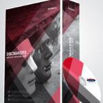
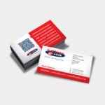
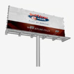
Deconstructed typography refers to broken letter aesthetics. This design trend was popular on brochures, business cards, posters and billboards the world over. This design is boxy, exciting and draws the eye particular in print marketing.
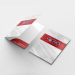
Used for text on the cover of a brochure, the viewer is certainly drawn to what lies beneath the pages. Deconstructed typography is about balance, using it appropriately and not filling a page with it. You don’t want to overwhelm the viewer with too much visual stimulation but you still want to draw their eye.
Take a look at these examples of successful deconstructed typography designs:
Back to Basics
Just like the fashion industry, trends in Graphic Design come in cycles and old trends quickly become all the rage once again. 2016 saw designers take nostalgia to a new level, with some big brands going back to design trends of yesteryear.
Kodak is an example of this. The brand said goodbye to their text based design and reintroduced their iconic black and red camera shutter logo.
Obviously, when brands do this, they tidy up and simplify the original design to fit with modern times (and mobile and tablet screens of course). We are excited to see if anymore brands go back to basics in the New Year. Watch this space.
Heightened Colours
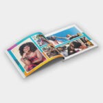
A common question posed by clients is? Can you make the colours pop? This is usually a request that is dreaded in graphic design terms. In the past, too much colour meant an eye-sore. This year, the trend toward bright colour, and popping colours has soared. So this dreaded question, is not all that dreaded anymore.
This year design has had a cheery facelift. Brands seemed to have moved away from pastel and muted colours and now embrace neon’s and primary colours. (Think, The Colour Run that has taken the world by storm).
Jetline: Branding, Graphic Design and Printing Services
You logo and brand design forms the foundation of your brand identity. These are graphical representations that fully encompass your business, becoming the visual signifier of your company. When clients or potential clients view your logo or design, they should immediately recognise your brand and service offerings.
Designing a logo, brochure, business card and any related marketing material is not a simple process. It takes strategy, testing, and a professional graphic designer and branding company.
Are you interested in creating an eye-catching and effective logo for your business? Contact our graphic design, branding and print experts today.

