The font that you choose for your brand needs to be well thought out and implemented across all platforms to promote brand association and brand awareness. Much like your colour scheme, your typography must be consistent, establishing an easily identifiable brand identity. Then it comes down to brand management, and this is key.
Before you choose what font is right for your brand, you need to fully understand the message you want to get across to your target market. Once this has been identified, you are able to concentrate on the art of your brands graphic design.
Defining Typography
To put it simply, typography is the art or technique of arranging type. It is a primary component of brand graphic design. Your choice of typeface and how you make it work with your style guidelines, colour scheme and design theme, has the ability to make or break a brands design success. Typography is powerful and is not an element of branding to be played down.

A typeface is made by talented craftsmen who spend a great deal of time and effort creating them. A professionally designed font, one that comes with various options to choose from (for your headers, body of text etc.) allows you the opportunity to put together a thorough font style guide.
Finding your Font
There is a vast array of free fonts and paid for fonts online, but it is important to remember that just because you have a huge selection to choose from doesn’t mean it is going to be easy.


Consider your target market and business message. Does your font speak to your audience and encapsulate your business personality? Typography is emotive and using the correct font for your brand will instantly trigger an emotion with your audience. To put this into perspective, think about how you feel when you see the Coca-Cola font or when you see the Metallica logo.
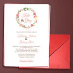
Never overlook readability. A great example of this would be a lavish script font. These fonts works well for headlines or headers of an invitation, but if you try to make use of this font in the body of your content your reader will become frustrated.
Important Typography Terminology in Graphic Design and Branding
-
Size
From wide and fat, to thin and narrow, typefaces come in many shapes and sizes. It is important to take the size of your chosen typeface into consideration. This is because different fonts take up a different amount of space on a page.

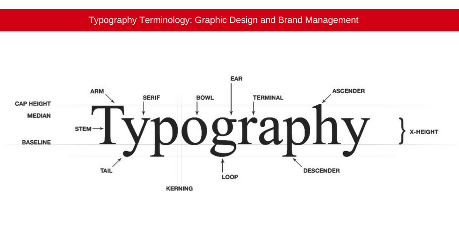
The height of each character is referred to as the x-height. When pairing typefaces, for example: when choosing the font for headers and the font for the body of your document, it is important that these share a similar x-height.
The width of each character is referred to as the ‘set width’ and it spans the body of the letter as well as the space between letters.
-
Leading
This is the vertical space between the lines of type. It is called Leading because in the days of metal typesetting, lead strips were originally used to separate type.

Most designers follow the general rule that your leading value needs to be bigger than the font size itself.
-
Tracking and Kerning
Kerning refers to the space adjustment between two letter pairings of a font. Without kerning applied to letter pairing, characters will take up a block of space and the next character will be placed after that space. When kerning is applied to letter pairing, the characters are able to vertically overlap allowing the characters to exist in the same vertical space. Kerning is used to subtract or add space between letters to create more aesthetically appealing and easy to read content.

Tracking refers to the adjustment of space throughout a group of letters or whole blocks of text. Tracking is used to change the overall appearance and readability of a line or block of text. You may apply tracking to all text or selected portions of text.
-
Measure
Measure refers to the width of a block of text.

To ensure the best reading experience, this has to be taken into consideration.
-
Scale and Hierarchy
To put it simply, not all your font is the same size. If it was, your reader would not know where to look first! In order to help the reader, consider larger headlines, slightly small sub headings and a smaller body type.

Please note that when creating your hierarchy, size is not the only way to define it. You can also make use of weight, colour and spacing in this regard.
Graphic Design and Printing Company South Africa
When customers and potential customers walk by your billboard or come across your brand online, they need to immediately identify your business because of your logo, colour and typography.
It is important that you work with an experienced graphic designer, branding and printing company and digital agency when it comes to choosing the right typography for your brand.
Jetline offers professional graphic design, printing and digital services.
Contact your closest Jetline branch today for all your graphic design, print, brand and marketing requirements.

